
5. TMI! Why no one likes a brain buffet?
Cognitive overload is the silent killer of user engagement.


How many open tabs do you have on your browser? I cannot handle more than five.
Like too many open tabs on your browser can be overwhelming and slow down your computer, our brains can also get stressed when we have to handle too much information.
This is called 'Cognitive Overload,' which can make it difficult to do things well, cause confusion, and make decisions tough.
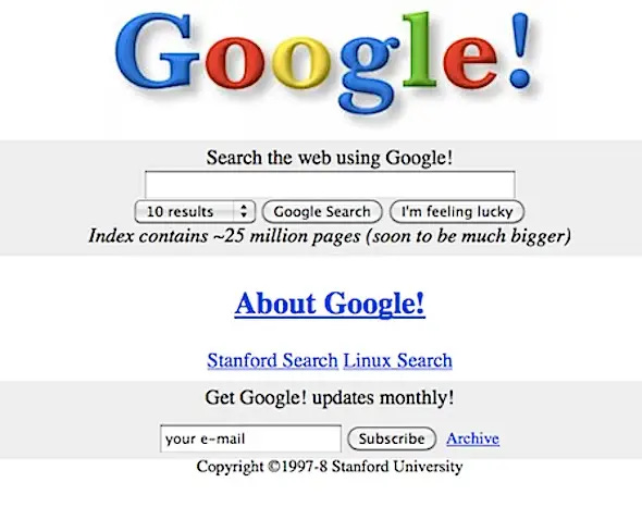
Look at these search engines that came before Google = cognitive overload.


And then came Google = no cognitive overload.
Cognitive overload is a common reason for poor engagement or conversion of websites and mobile apps.
It happens due to three reasons -
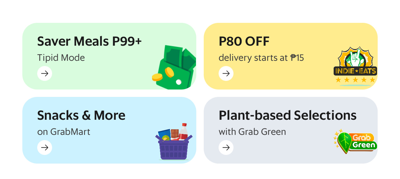
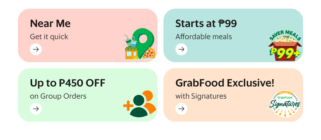
When users are presented with Too Many Choices: If an app gives too many options, it can make it hard for users to choose, and they might not be happy with their decision. A classic example is a food delivery app. These apps often list hundreds of restaurants, each with its extensive menu. While offering flexibility, this variety can overwhelm users unsure about what they want to eat. That’s why Grab, for example, helps reduce this overload by segmenting its offers into categories that make decision-making easier.
When users have to Make Complex Choices: If your product requires them to make too many complex decisions, it takes them longer to decide what to do, and they might ultimately defer or not do it at all. This is a common scenario in financial apps. It can be overwhelming for users to choose from various product features, review extensive market data, assess risk tolerance, etc.
The Robinhood app is a good example of reducing users' cognitive load through simple interfaces. When the app is white, the market is open. When the app is black, the market is closed. The lines and text are red when your portfolio or a stock loses value. Their best decision support feature is ‘“People Also Bought,” a nudge common in e-commerce but rare in financial services. This provides a great way for new users to decide which stocks to invest in quickly.

When users See a Complicated Design: If an app has many buttons or menus that are too hard to use, it can confuse users. For example, the Zara website appears like a fashion magazine but is hard to navigate visually. Adobe lost market share to Canva because it is too complex for beginners or casual users.

A long series of steps during in-app onboarding can cause users to drop off. A survey found that users prefer mobile app onboarding to take less than 60 seconds. Each additional screen or question during onboarding creates friction, increases cognitive overload, and increases the drop-off rate. Data shows that users can decide to abandon an app in less than 20 seconds.
How do you identify if part of your website or app interface creates cognitive load for your users?
Several tools utilize data science to help you identify when users feel this overload, such as -
Studying How Users Behave in the App: Tools such as Google Analytics, Segment, Mixpanel, etc., provide data on funnel performance and time spent on a screen that helps you understand which buttons users click or whether they start but don’t finish tasks.
Testing Different App Designs: Tools such as Optimisely, Google Optimize, and VWO allow you to test different website/app designs. This includes looking at how quickly tasks are completed and how satisfied users are.
Analyzing User Feedback Tools such as Hotjar, Fullstory, etc., help you study heat maps of user behavior, their rage clicks through recordings, and mini-surveys that help you gather user feedback, such as why a user abandoned a page.
As the title of the classic book on web design and usability by Steve Krug goes, "Don't Make Me Think,” the key principle to follow when designing any interface, whether website or app, should be to make it so user-friendly that it doesn’t require users to expend unnecessary mental effort.