
58. Give me a good lovemark 😘
And make it last longer 😉

Lovemarks.
Ahem Ahem, it’s not what you are thinking.

Lovemarks is a phrase coined by Kevin Roberts, which is about how brands can create deep emotional connections with their customers through delightful interactions.
What type of interactions can be called lovemarks? According to Elena Verna, these are experiences that:
Create unexpected delight
Make a digital experience feel more human
Have the potential to create word-of-mouth referrals
A simple example is in Viber - you must have seen the confetti that appears when you wish someone Happy Birthday. You don't get the same experience in WhatsApp, which makes it more delightful to use Viber.
Another more complex example is the Google Doodles that appear on many special occasions. An unexpected doodle makes the mundane experience of search more special + you learn something new about the day.

Similar to Maslow’s hierarchy of human needs, UX expert Aaron Walter’s book ‘Designing for Emotions’ introduces the pyramid of user needs that looks like this:
Functional — solve a problem
Reliable — be up and running at all times
Usable — offer a good user experience with emphasis on consistency
Pleasurable — this is where delight comes into play
He says that when users are surprised through pleasurable experiences, it leads to an emotional gut reaction, which makes the product stickier and hence strengthens brand loyalty.
And why does it matter?
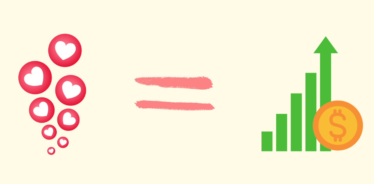
According to McKinsey & Co., a delight can have a significant measurable impact on customer referral, retention, and revenue across sectors, products, and geographies.

So basically,
Recently, I have come across these three examples of lovemarks that impressed me with their simplicity and thoughtfulness -
Tonik’s QRPH Lucky Fortunes - QR payment is a pretty mundane banking task. Tonik turns it into a micro-moment of joy by letting you scratch part of the payment confirmation screen to unlock a digital fortune cookie. This creates positive anticipation for an otherwise routine step in the user journey and differentiates it from all the other banks offering the service.
What to do: Inject joy into a repetitive, low-engagement task.
According to Duolingo, delight is the difference between a product you use and a product you love. That’s why every interaction in the app is designed with delight in mind. Duolingo’s owl, humor, and playful nudges turn the boring task of learning a language into fun. Recently, they made a notable product update, introducing energy signs to indicate progress, a form of positive reinforcement.
What to do: Use personality to humanize the brand and make interactions memorable.

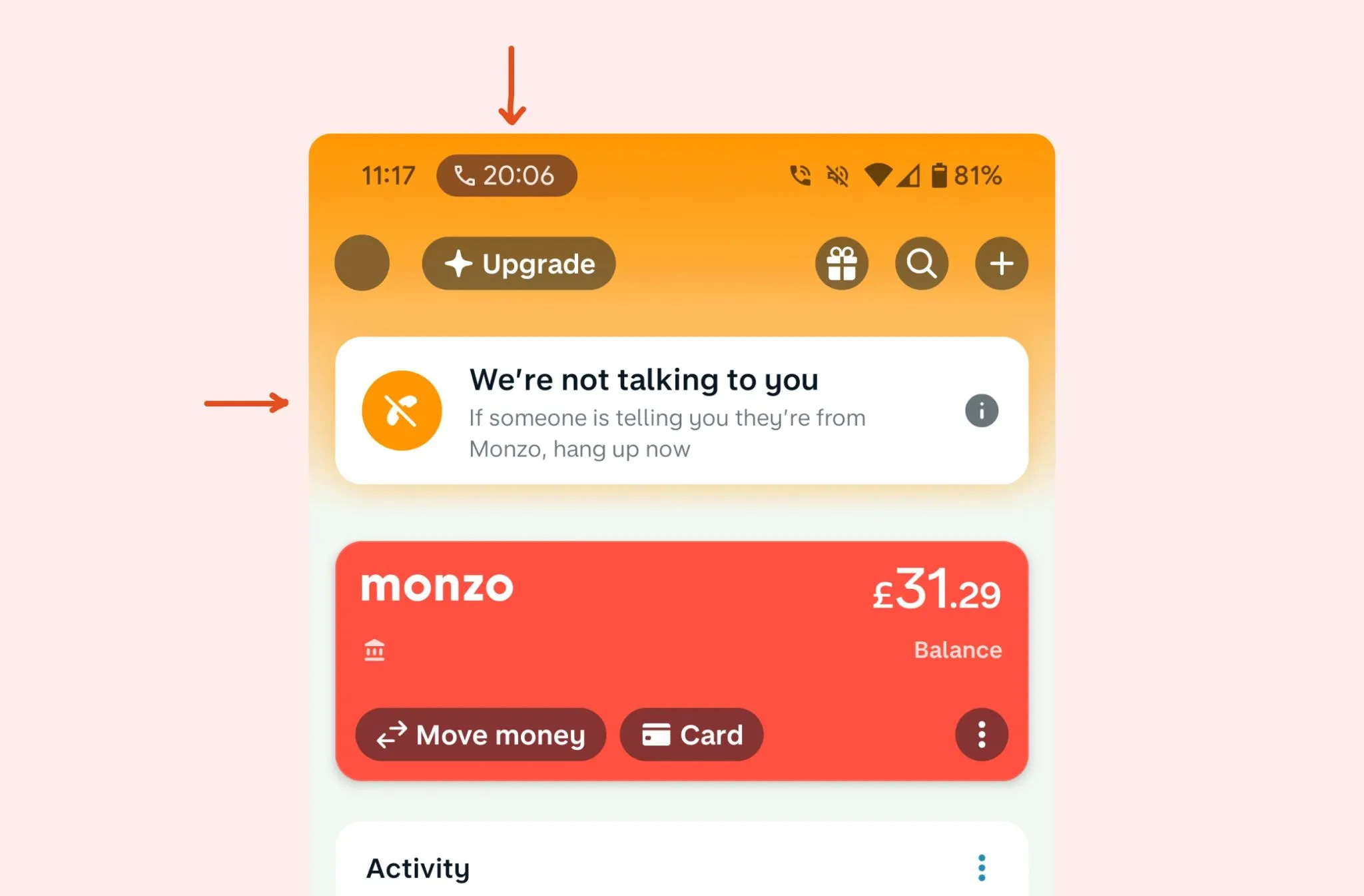
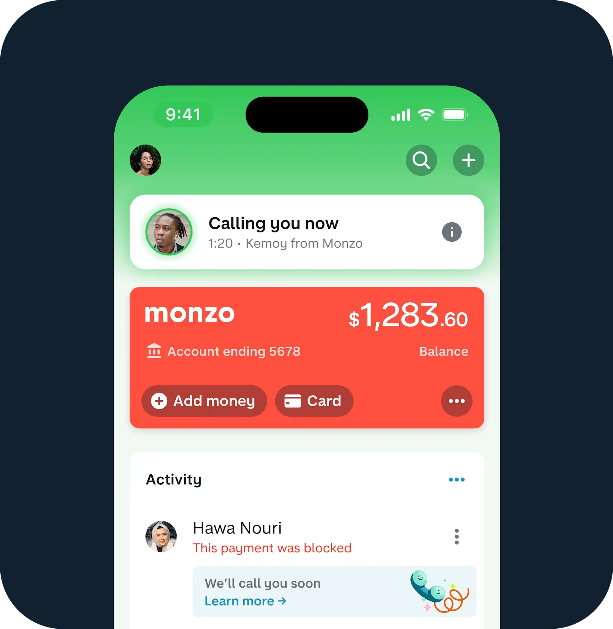
Monzo’s fraud protection message - If you are on a call and open the Monzo app, you can check if it’s a legitimate call from Monzo. It's so simple and effective in preventing phishing calls.
What to do: Turn a moment of potential anxiety into reassurance and trust.
How to create lovemarks
Look at your user journeys and pick one point where a user may experience anxiety or boredom. Add a simple emotional touch through visual, copy, or interaction.
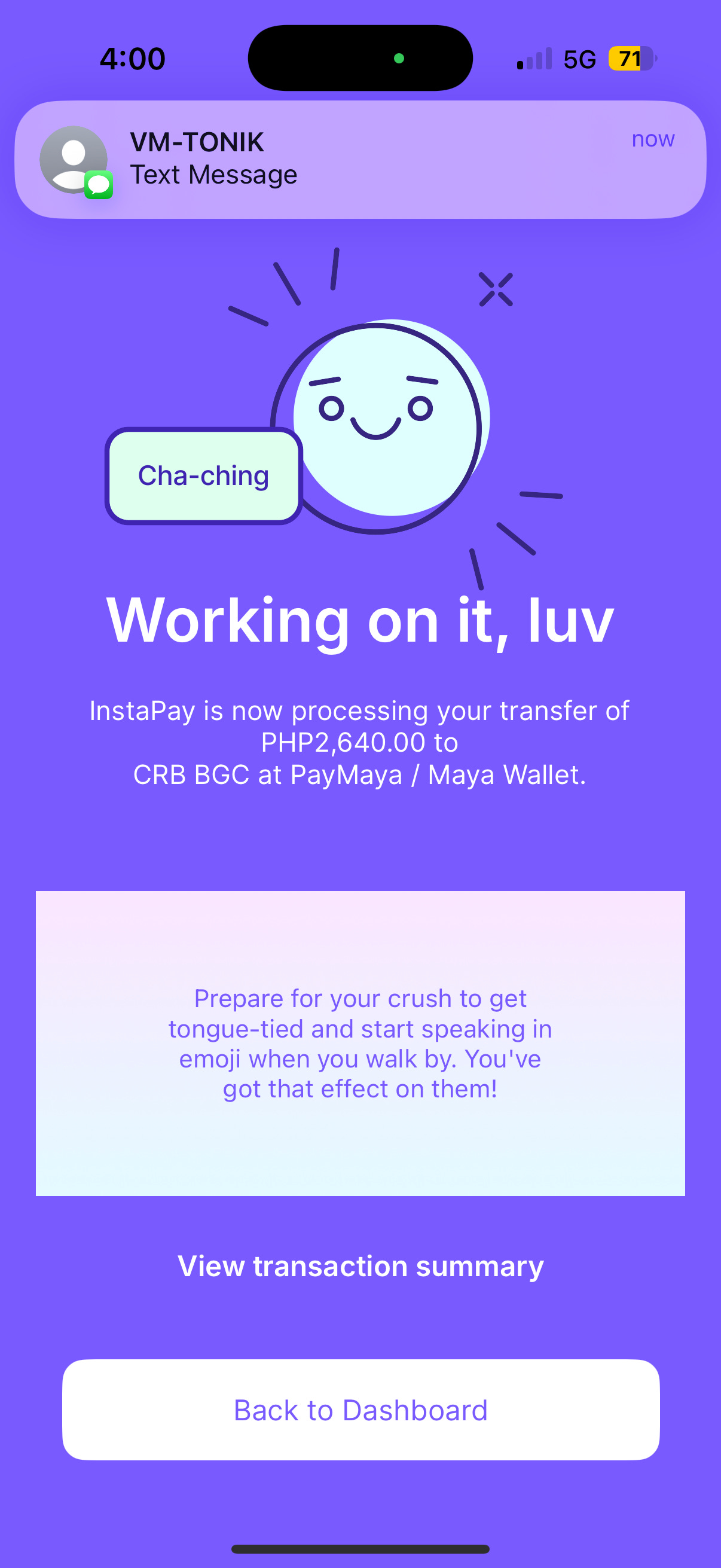
Apps often have screens that require no interaction, filled with white space. For instance, the transaction screen of a digital wallet I frequently use has an empty space that is often used to display ads.
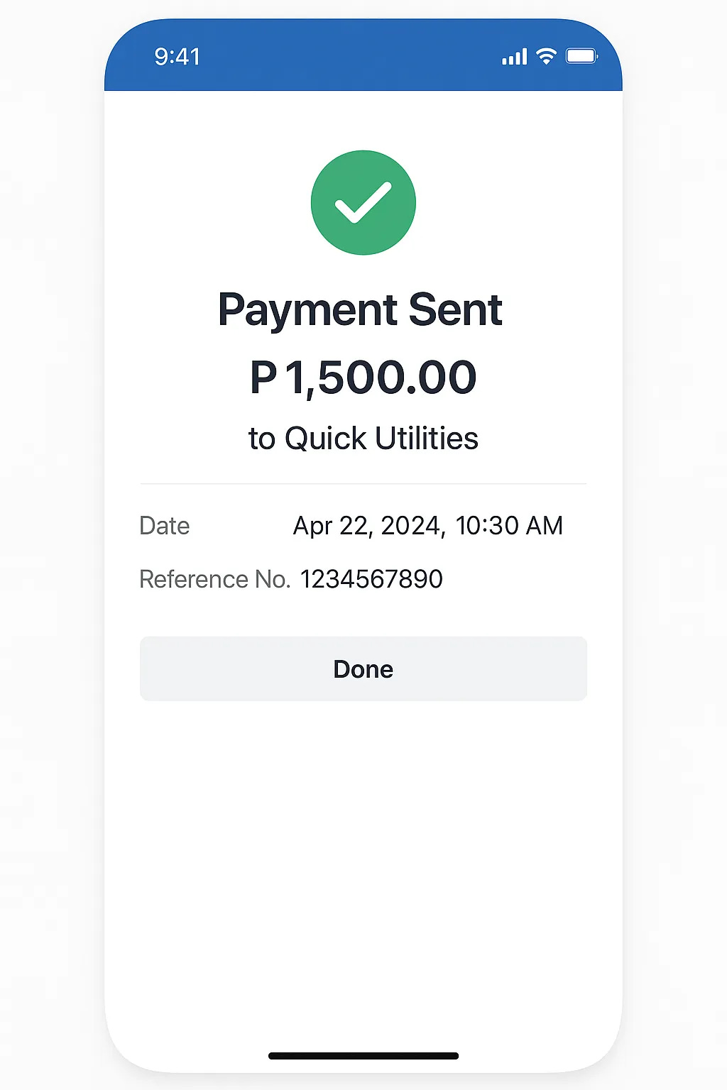
But a better use of this space could be to show something delightful, such as:
A fun fact or trivia related to the transaction (“Did you know this is your 50th payment this month?”)
A personal milestone (“You’ve just sent ₱10,000 to friends and family this year!”)
A small surprise (“You make generosity look good!”)
A helpful tip (“You can save on transfer fees if you send before 4 PM.”)
A seasonal message (“Happy Lunar New Year!”)
TL;DR Good lovemarks last longer than good ads. So turn the ‘dead space’ in your app into an opportunity by:
Sparking joy in mundane (Tonik)
Connecting with personality (Duolingo)
Turning anxiety into reassurance (Monzo)
I really enjoyed writing this. If you enjoyed reading it, please tap the Like button below ♥️
Thank you!
Munmun