
23. Simple or Complex Charts?
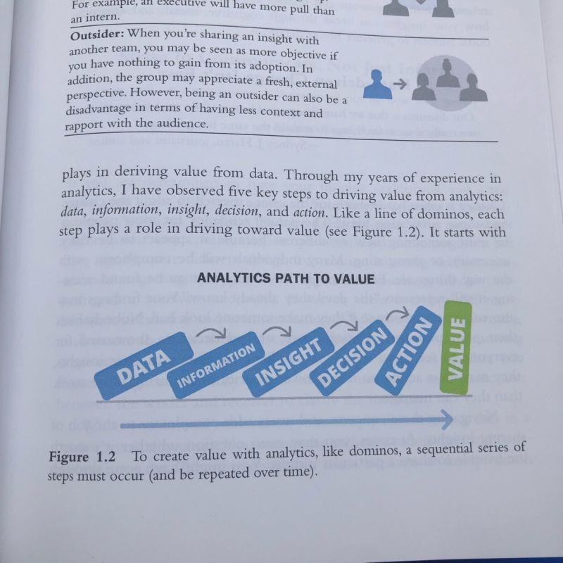
Irrespective of the form chosen, creating value from data requires a series of sequential steps.


Recently, I read a couple of great newsletters by two experts in data visualization and noted some powerful points about what makes data truly effective.
First, Brent Dykes, in his newsletter Analytics Hero talks about the “subtle but important distinction between visualizing ‘the data’ and visualizing ‘the message.”
“When analyzing or sharing data, our primary concern is often how to visualize it in a manner that makes the raw data more accessible and understandable at a glance.
The goal is to help people digest the information easily and interpret what it means.
Hence, the visualization chosen should help them make comparisons and spot key anomalies, trends, and patterns.”
In his book Effective Data Story Telling, he also states that “To create value with analytics, like dominos, a sequential series of steps must occur.”
That great visualization is just a means to the end - to support great decisions.
Avinash Kaushik, the OG of marketing analytics, has written extensively on this topic. His latest LinkedIn post talks about why most dashboards end up being disappointing. Excerpts from one of his Occam’s Razor newsletters:
“One of the reasons so many visuals are so very complex is that the Analyst/Creator is trying to demonstrate how clever they are.
While these charts are interesting ways to depict data, there is value of making data accessible. The result then is both a mind and heart connection that drives action with a sense of urgency.”
So, in this context, when I discovered a few new ways of data exploration as part of my data science certification course, I deep-dived into the value of these seemingly complex visualizations and wondered what incremental insights one may glean from them and what kind of decisions could they help drive.
What follows might seem meant for data nerds, but my goal is to highlight how analysts need to think critically when presenting such charts to leaders. The goal is not to let them “figure it out” but to bridge the critical last mile when it comes to data impact—being able to take meaningful business actions.
I want to call these new ways (at least for me) of data exploration:
The Unusual Plots!
If you are familiar with basic statistics, you may know that a box plot (or box-and-whisker plots) is one of the most common ways of displaying data distribution.
It shows a five-number summary: minimum, first quartile (Q1), median (Q2), third quartile (Q3), and maximum.
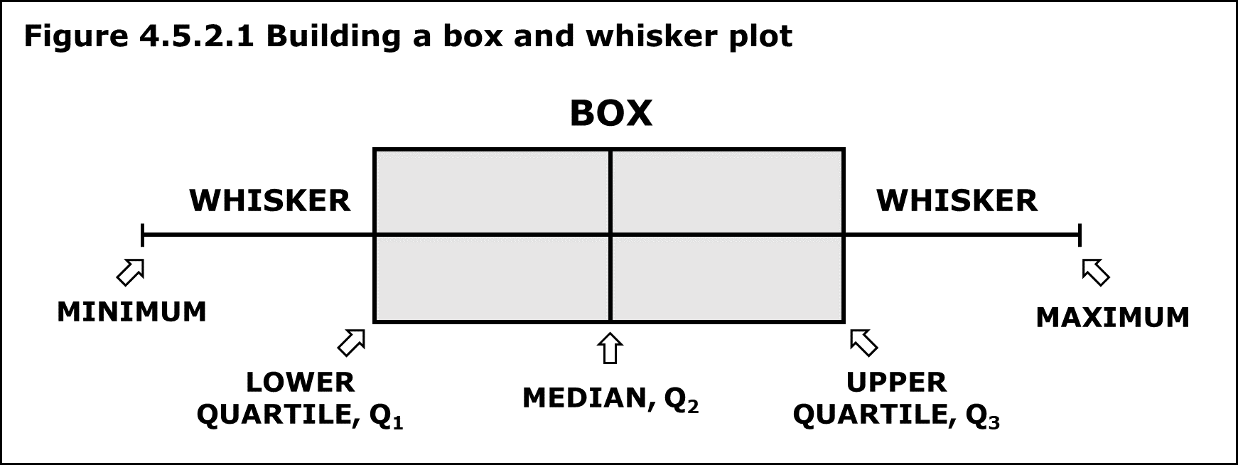
These four “Unusual Plots” below are evolutions of a box plot and show the numeric distribution of data over categories.
I analyzed how these visualizations differ from one another in a marketing scenario and highlighted how each chart’s features could be used to take different actions.
Whether you ever use these plots or any other form of visualization, think of Brent Dykes’ framework of dominoes that your analysis should trigger.

